Yes, it was mostly the pandemic that halted my teaching, but I was ready to hit pause. While I really enjoyed workshops, ultimately I wanted to be an artist that teaches sometimes, rather than a teacher who occasionally makes art. I was saying yes to any opportunity and it got to be too much to keep up with- scheduling, supplies, project creation, marketing. While I didn’t want to stop teaching forever, I wanted to refine my offerings and create something more intentional that reflected what I am truly passionate about. But I didn’t really know what that was just yet.
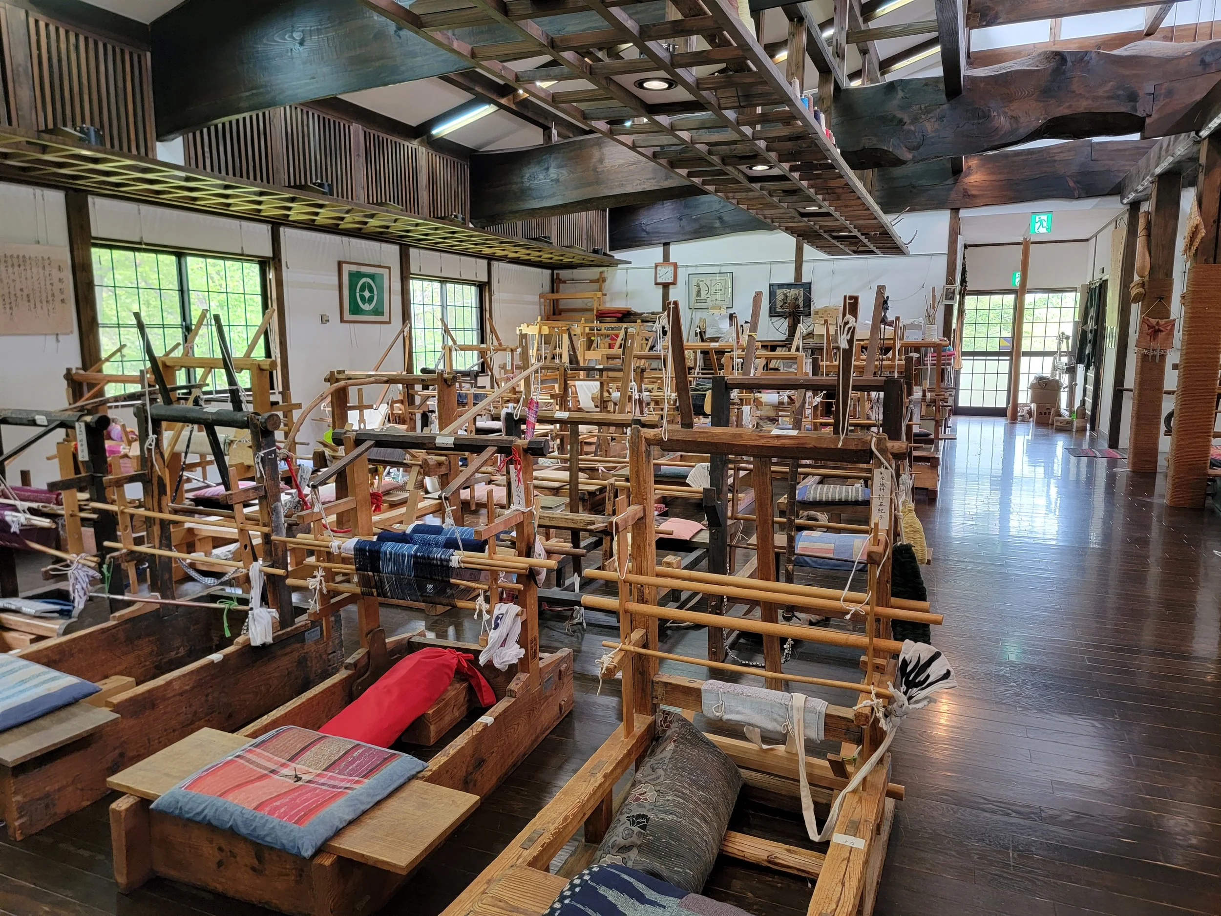
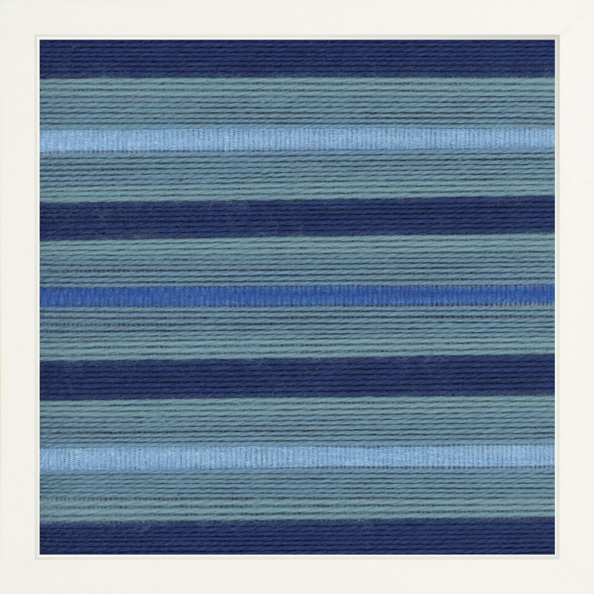
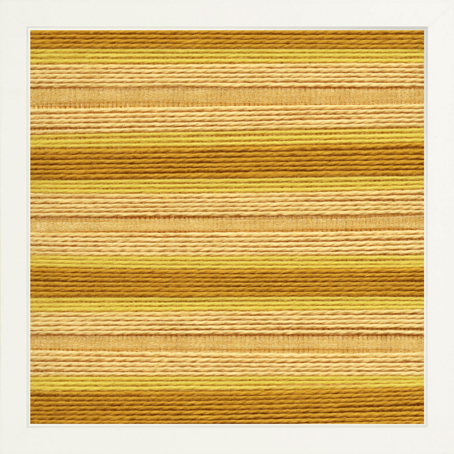
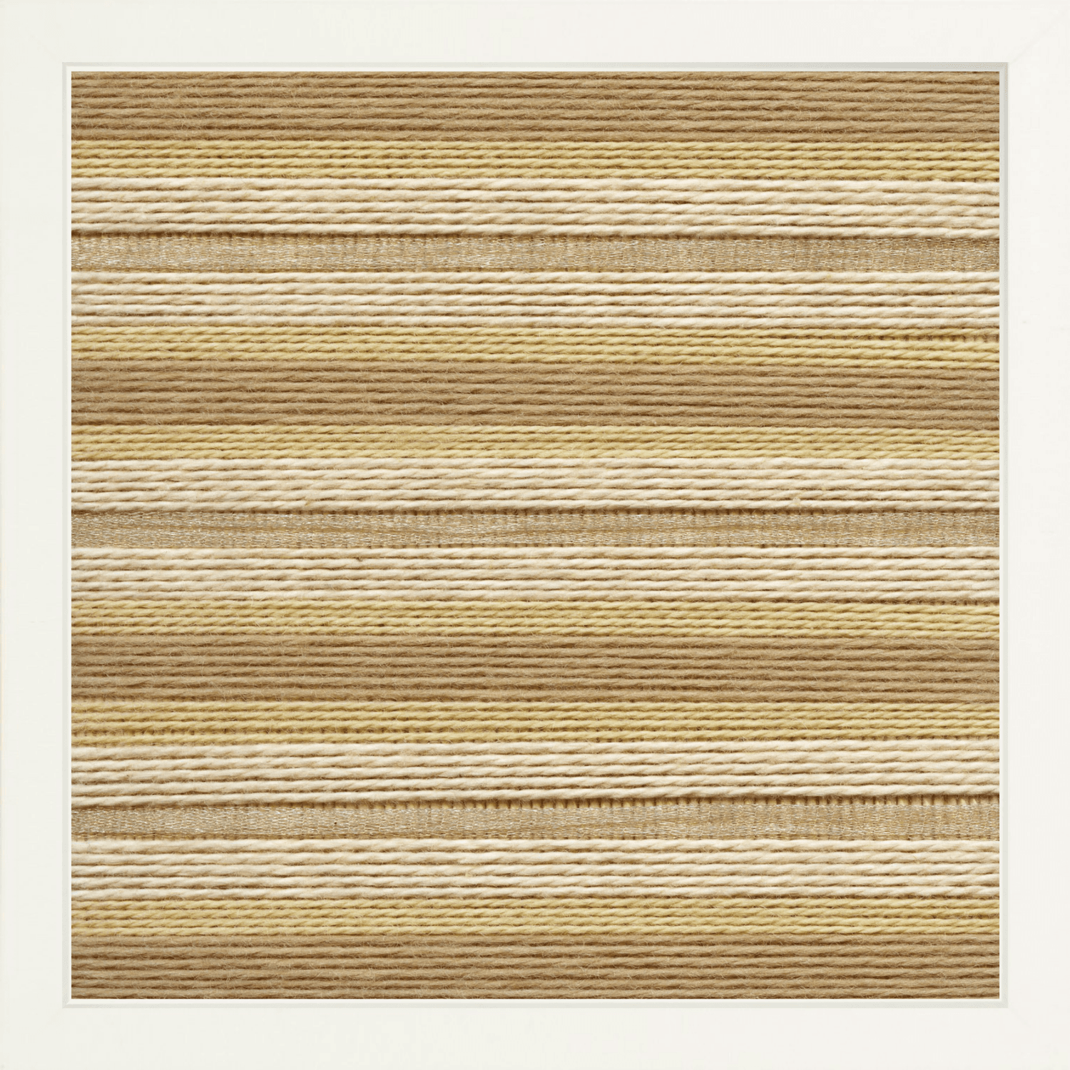
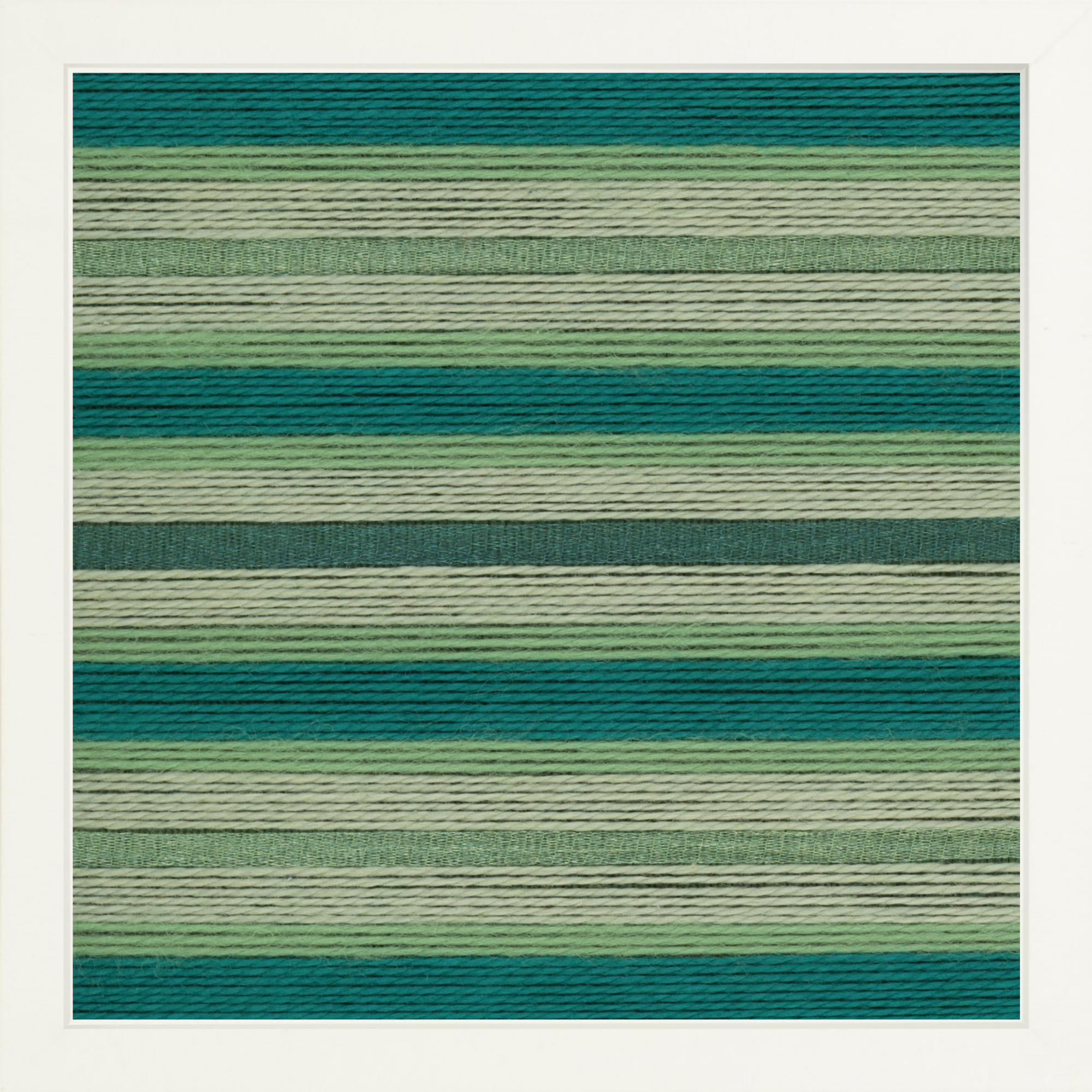
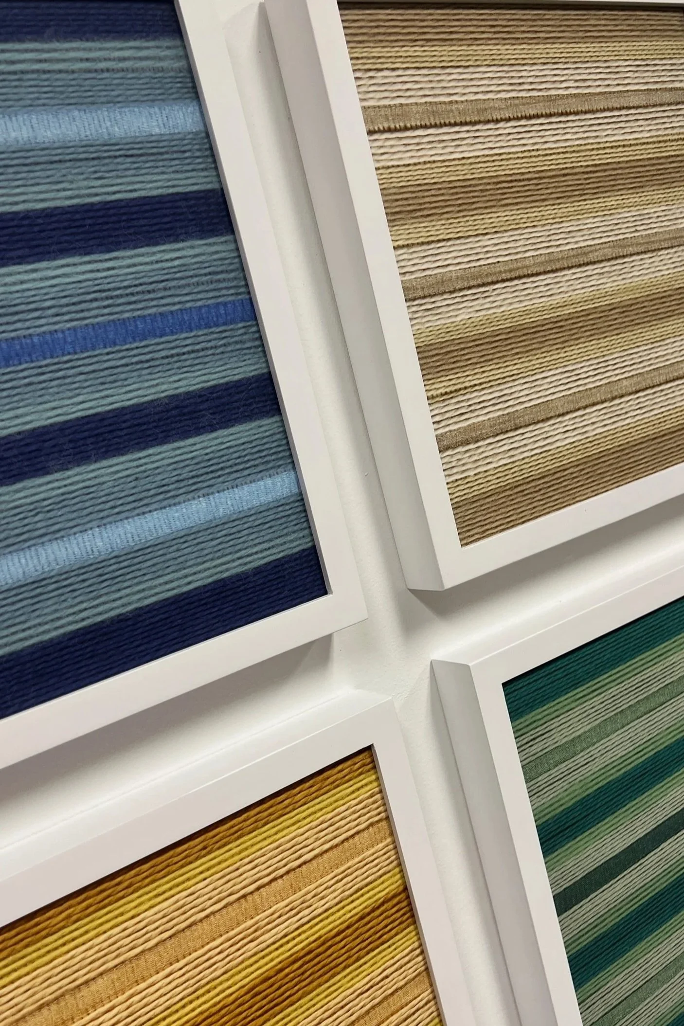
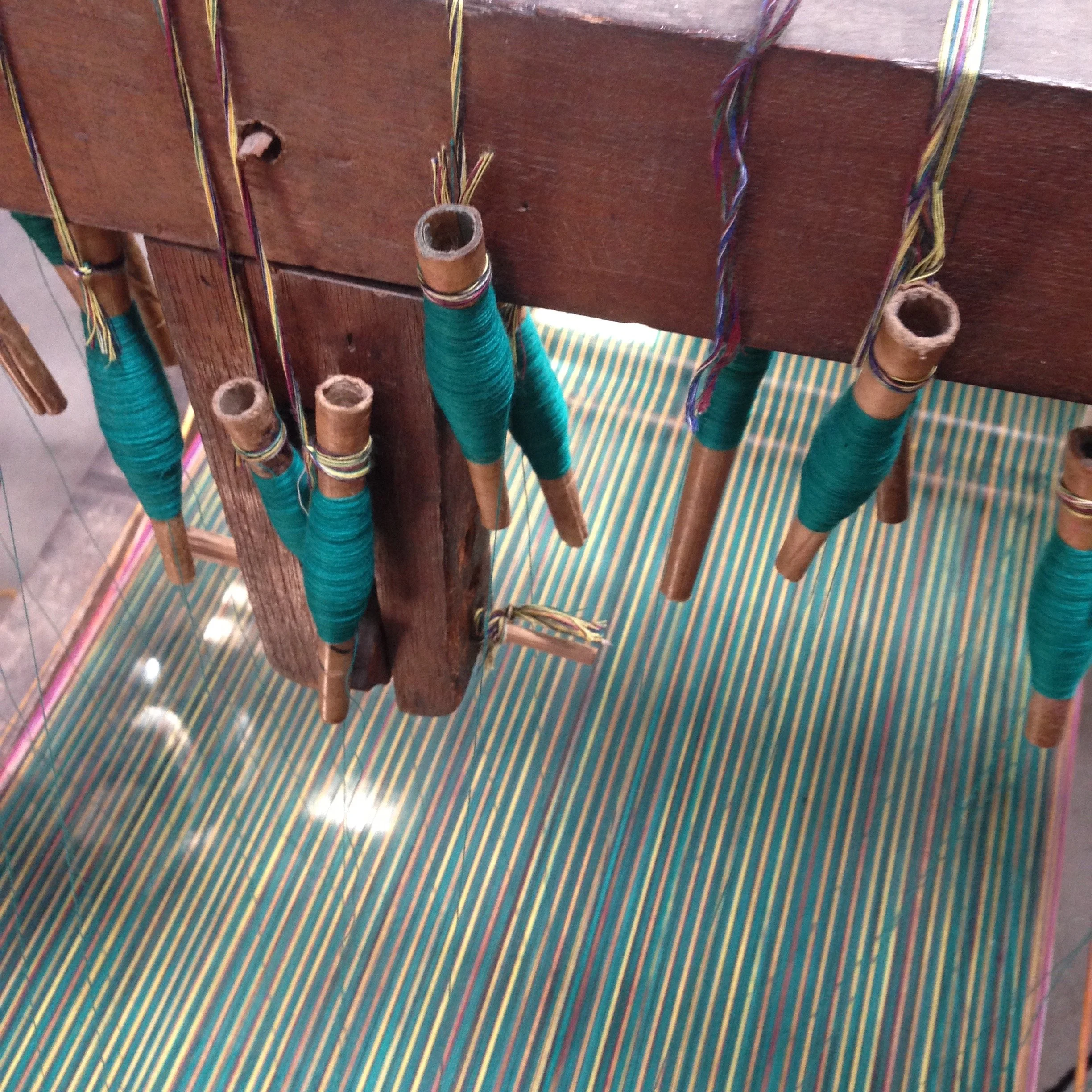
The hiatus ended up being a long one as it’s now five years past the shutdown. I’m slowly dipping my toes back into teaching and doing it differently this go around. When creating my art practice I asked myself, what creative act do I want to do repeatedly that also produces a beautiful result? So similarly with my workshops I ask myself- What do I want to teach over and over that will produce a beautiful result? The answer I keep coming back to is embroidery. Embroidered clothes are so custom, so special and eye catching. There’s a low bar for entry in embroidery- a newbie can learn a few simple stitches and quickly make a big impact. And it’s no surprise that pearl cotton embroidery floss is my absolute favorite medium to work with.
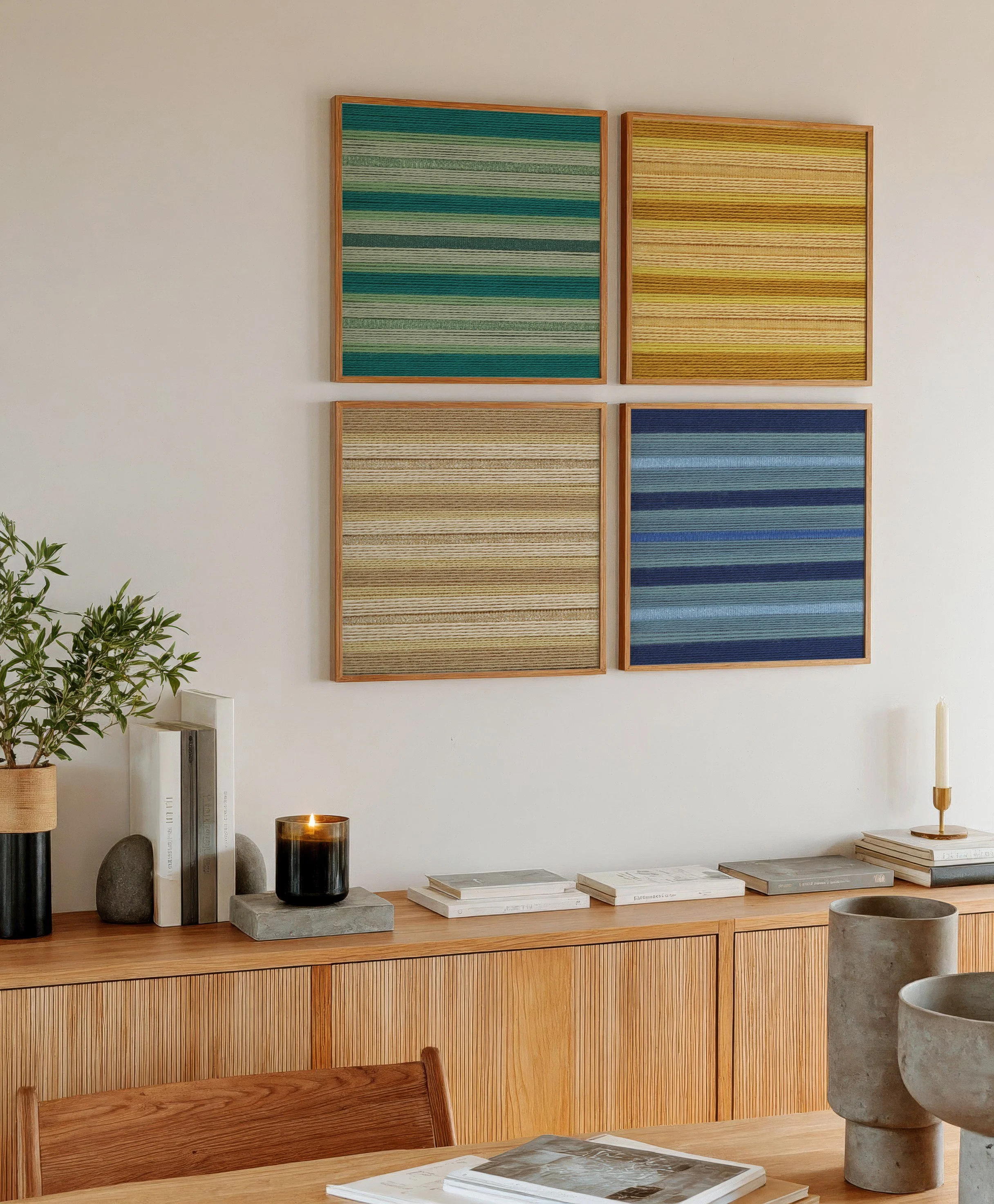
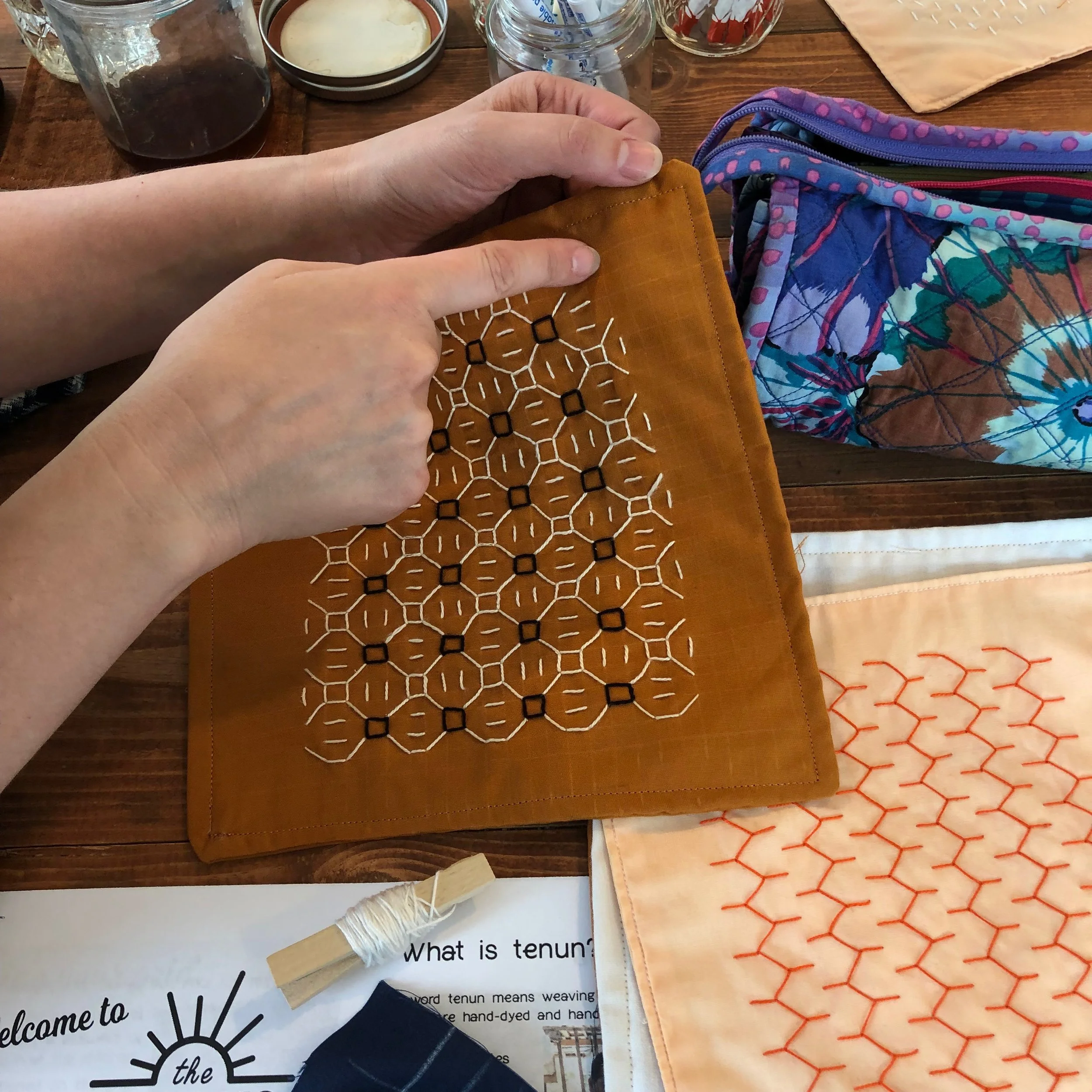
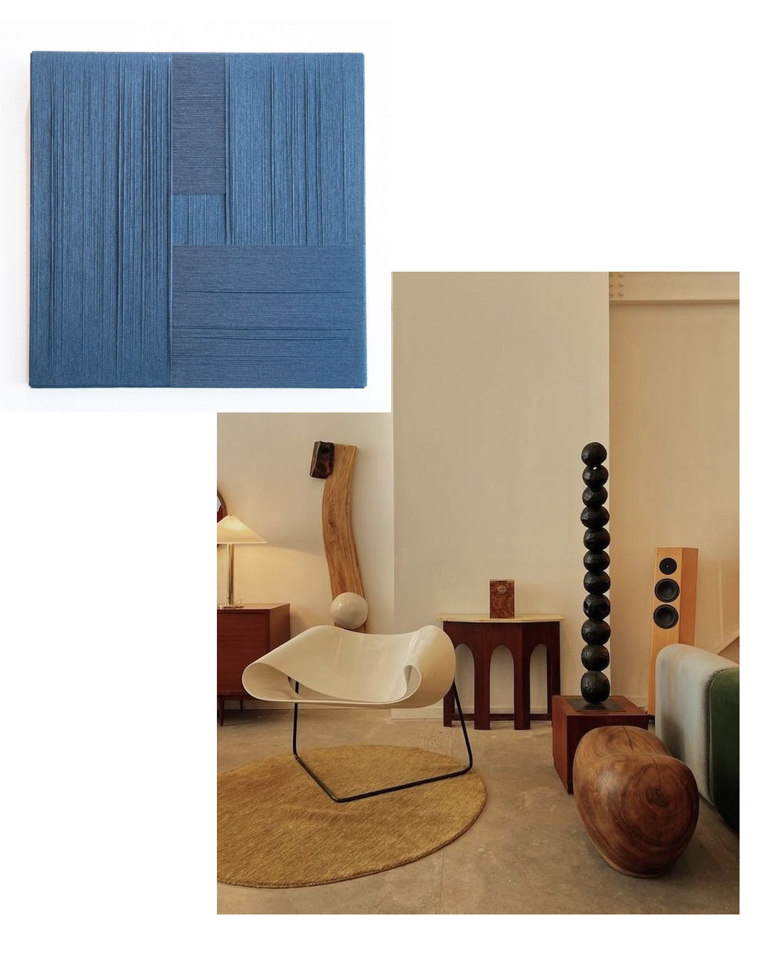
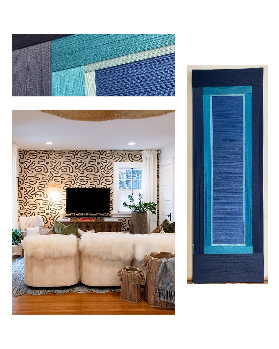
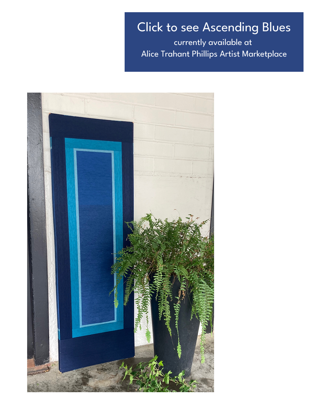
I’ve been stitching this sampler for a few weeks and it’s been a glorious experience in flow. I am obsessed. I am staying up way too late stitching into the wee hours of the night and I just can’t get enough. I love how it’s coming along and I’m pretty sure I’m going to mourn the completion of this project. But with the completion comes the true pay off- teaching this craft to others.